If you follow web design/development at all you will know that CSS3 (and HTML5) are talked about more than healthcare reform in Washington DC. Some of the things you can do with CSS3 are amazing. In this post I have searched the web for 60 of my favorite CSS tutorials, tricks, and tools that are sure to bring some interesting elements to your website.
Miscellaneous Tutorials
1.Create A Clean and Stylish CSS3 Contact Form
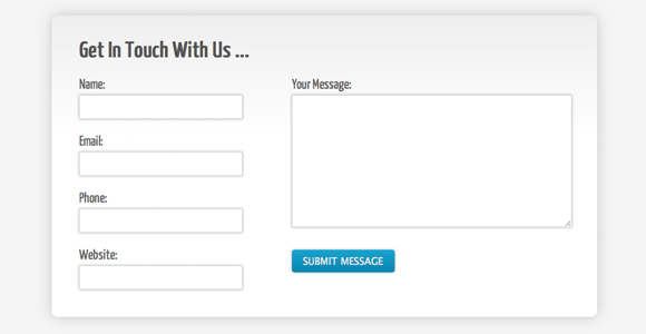
Building stylish contact forms typically requires the use of images (and maybe some JavaScript) to create something that looks professional. However, with CSS3 it’s now much easier to create some nice effects that don’t require the use of any images, yet can still look clean and stylish.
2.How To Use CSS3 Media Queries To Create a Mobile Version of Your Website
In this article I’ll explain how, with a few CSS rules, you can create an iPhone version of your site using CSS3, that will work now. We’ll have a look at a very simple example and I’ll also discuss the process of adding a small screen device stylesheet to my own site to show how easily we can add stylesheets for mobile devices to existing websites.
3.Mastering the 960 Grid System
In this article, you’ll master the 960 grid system by dissecting the 24-column version demo. If you’ve only used 960gs before for Photoshop mockups, consider this your lucky day. By the end of this article, you’ll be able to convert your designs to HTML and CSS in no time at all.
4.How To Beat Form Spam With Just CSS
I thought today that I would share with you a method for beating spam bots that I’ve been using for nearly 3 years and works consistently. It’s been incredibly effective, doesn’t carry the usability issues and implementation hassles of something like CAPTCHA, and uses nothing more than a bit of CSS.
5.Getting to Work with CSS3 Power Tools
Each of these features can help replace some of the images that you might have created in Photostop in the past. By doing this, you are making your website more maintainable since you can change a property just by changing your CSS file rather than editing an image in Photoshop. You are also making your website load faster since images use a lot of bandwidth. Let’s explore these features one by one
One of the most common mechanisms for providing extra details beyond what you can see on the page is the tooltip (a design pattern for showing tips about a particular element on a screen).
7.Sleek Card Pockets using CSS Only
One of the great things CSS3 has brought to web developers is the ability to create transitioning effects on elements. The whole benefit of this is to turn ten to twenty lines of Javascript code into five or so lines of CSS. Combine this property with other new CSS3 properties and we can create visually appealing and realistic looking card pockets on a web page.
8.CSS Reset – a simpler option
A quick presentation on CSS Reset including a basic explanation, an outline of some of the advantages and disadvantages, as well as a simpler reset option.
9.Getting Buggy CSS Selectors to Work Cross-Browser via jQuery
Although the lack of cross-browser CSS selector support has caused a number of useful CSS selectors to go almost unnoticed, developers can still manipulate styles on their pages using some of these little-used selectors through jQuery.
Ah, inline-block, that elusive and oh so tempting display declaration that promises so much, yet delivers so little. Great article that explains whan an in-line block is and how it works.
11.Have Fun w/ Borders – Beveled, Pressed, & More!
Since I released my new redesigned blog, a lot of people have asked me how I styled the pressed effect on my category navigation. I would like to share some simple border style tricks to get various effects for your next project.
12.IE CSS Bugs That’ll Get You Every Tim
Article on how to fix those nasty CSS bugs in Internet Explorer.
Navigation
14.Create a Fun Animated Navigation Menu With Pure CSS
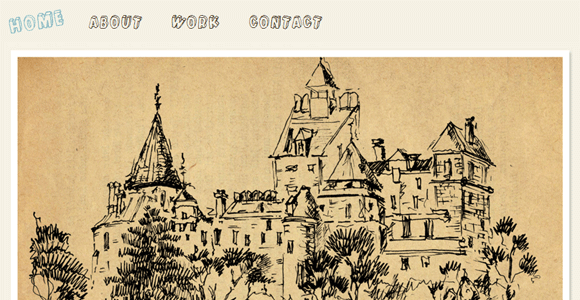
However, CSS3 offers a glimpse into a possible future where basic animations are performed with straight CSS completely independent of scripting. Today we’ll take a look at how to use CSS3 to create a fun and unique navigation menu that uses @font-face, transforms and transitions.
13.4 Ideas for Styling Link Hovers with CSS
Links are a basic part of the Internet. They’re what keep it connected, really, so why not make these connections fun? A link hover is what happens when you hover your mouse over a link (obviously). Usually you’ll see an underline, or an underline removed, or a different colour. But there are many ways to show people that they can click, so I thought I’d show you four of my favourites.
15.CSS3 Minimalistic Navigation Menu
So today we are making something practical – a simple CSS3 animated navigation menu, which degrades gracefully in older browsers and is future-proofed to work with the next generation of browsers.
As we know, CSS3 has many good features for help us creating more sweet User Interface. One of them is box shadow, it helps us adding shadow effect on each styled element. You must be familiar with drop down menu with shadow effect on it, I usually add the effect using some images but now we’ll create that one using pure CSS.
17.iPhone “slide to unlock” Text in WebKit/CSS
There are a couple of WebKit specific properties that make giving text a gradient background possible.
This is a request post from my reader. He asks me how to create a simple menu that have a flying effect when user hovering them using only CSS. As we know CSS3 is more powerful with its transition property, it help us creating animation without any JavaScript or even Flash help. We’ll use them for creating the flying effect and here is the result. Enjoy!
19.Fading Button Background Images With CSS Transitions.
When Firefox 4 is released this October, browsers that support the CSS3 transition property will make up approximately 30% of the market (providing current Firefox users upgrade). With this in mind, it now becomes viable to consider CSS as an alternative to using JavaScript to achieve fading :hover{} effects on buttons and other interface elements. This article explores a simple method for doing this, with fallbacks for other browsers.
20.Popout Details on Hover w/ CSS
I recently saw a hover over trick that caught my eye and I thought it was a pretty clever way of showing more details on an element. I decided to give it a try and the solution was quite simple.
Take a standard set of links and turn it into the ever so stylish Mac OS X icon dock.
Buttons
31.Roll Your Own Google Buttons
Google has a new focus on webkit-specific properties thanks to their new Chrome browser, which uses a branch of the same rendering engine Safari uses. This has actually allowed them to target the Google homepage to the webkit engine, probably after some sort of browser detection.
23.Flexible CSS3 toggle buttons
Use CSS to create stylish toggles, buttons, and address bar. Great for mobile websites.
24.Styling pretty buttons with only CSS3
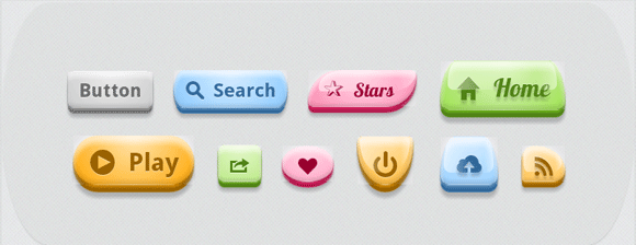
What I am going to show here, is how you can use some of these new CSS3 properties to create lightweight, good looking buttons! The code we’ll be writing will be very easy to adjust. It will have completely flexible, so the buttons can be any size, ratio, color, font and you only need to edit the css file.
25.Build Kick-Ass Practical CSS3 Buttons
What once required background images and icons can now be created with plain-old CSS.
26.Realistic Looking CSS3 Buttons
Create realistic looking, “pushable” buttons using CSS3.
27.Building beautiful buttons with css gradients
In this demo we’ll walk through a simple use case for the new gradient capabilities coming in Firefox 3.6. We’ll build a nice-looking embossed and beveled button using gradients and existing CSS properties.
28.Super Awesome Buttons with CSS3 and RGBA
One of our favorite things about CSS3 is the addition of RGBA, a color mode that adds alpha-blending to your favorite CSS properties. We’ve kicked the tires on it a bit with our own projects and have found that it helps streamline our CSS and makes scaling things like buttons very easy. To show you how, we’ve cooked up an example with some super awesome, scalable buttons.
29.Extremely fancy CSS3 buttons
Create a fancy button without using images that is scalable, customizable, and compatible with IE7 and IE8.
Today I’m going to show you how to put the CSS gradient feature in a good practical use. Check out my demo to see a set of gradient buttons that I have created with just CSS (no image or Javascript).
Create CSS buttons that are sexy looking, really flexible, but with the most minimalistic markup as possible.
Text Effects
32.Subtle CSS3 Typography that you’d Swear was Made in Photoshop
Thanks to text shadows, outlines, transitions, and even text gradients, we can now create cool typography that you’d swear had to be made with a program like Photoshop. Nope, all CSS3 baby!
33.Create Beautiful CSS3 Typography
In this tutorial, we’ll look at how to take basic markup and transform it into an attractive and beautiful typographical design through pure CSS3. There are no images or other external resources, just pure CSS magic. We’ll also touch on some general typographical concepts along the way.
34.How to Create Inset Typography with CSS3
In this tutorial, we’ll create inset type, a popular text treatment, using CSS.
35.Adding an outline to your text using the CSS3 text-stroke property
In this tutorial I’ll show you how to add an outline, or stroke, to your text using the CSS3 text-stroke property.
36.How to Create a Cool Anaglyphic Text Effect with CSS
Anaglyphs are those amazing 3D images that are created by offsetting two of the red, green and blue channels, and are viewed with those nerdy looking 3D glasses with different coloured lenses. I don’t know if this effect works for real, as I’ve unfortunately misplaced my 3D specs, but it’s a pretty cool text effect nevertheless!
I felt inspired to put together an alternative example. In this case: Text Rotation. The example uses an image sprite and a sprinkle of CSS to get things positioned right.
38.Text Embossing Technique With CSS
In this article I will show you a couple of real world examples of this, as well as describing how to implement this effect with CSS.
39.Create a Letterpress Effect with CSS Text-Shadow
With the recent support of text-transform in Safari and Firefox (3.1+) the effect can easily be created without needing to use any image replacement techniques. This means your text is much easier to edit, and has the benefit of being rendered directly in the browser.
Do you want to create fancy headings without rendering each heading with Photoshop? Here is a simple CSS trick to show you how to create gradient text effect with a PNG image (pure CSS, no Javascript or Flash).
Image Effects
41.Fancy Image Hover Using CSS3
So here we will try to create fancy image hover with css3 as you all know we can have cool image hover effect using jquery but now using transform and transition properties of css3 we can have the same cooler effect with css3 only.
42.Fancy Inset CSS Image Borders
In this article we will explore how to add a nice, styled, inset double border to any image. This effect works in all modern browsers and degrades gracefully for Internet Explorer.
43.Super Cool CSS Flip Effect with Webkit Animation
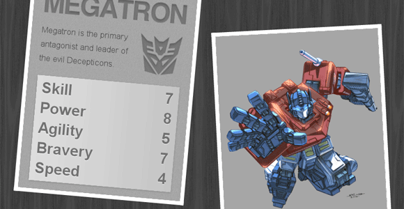
There’s some seriously cool transform and animation effects available through the webkit engine that can really spice up the web experiences for users with the Safari browser. Here’s a quick look at how the rotateY property can produce a flip effect, and how it can be used to create a super cool Transformers themed top trumps design.
44.How to Create a Fancy Image Gallery with CSS3
A tutorial about how to use CSS3 to make an image gallery with animation. The gallery is going to be usable in browsers without support of the animation.
45.Easily Turn Your Images Into Polaroids with CSS3
Turn a set of images into a great looking set of polaroid pictures.
This tutorial aims to showcase a method of displaying content based on the lightbox, which is web accessible and (excluding Internet Explorer) will require no scripting at all. Sound like fun? Well, let’s explore the subject further!
47.Create a image gallery with CSS3 transitions.
We are going to create a tabbed image gallery but animated using some CSS transitions. All of this is going to be built with HTML5 & CSS3, there is going to be NO use of flash or javascript for this example.
48.Sexy Image Hover Effects using CSS3
In this post I am going to show to How to create a sexy css effect on image hover.This kinda effect you have seen before in Flash or in javascript as well.But why use Flash or js when CSS can do the same work.
49.Pure CSS Sliding Image Gallery
The idea is to get one image to slide in while the current image slides out. There’s a lot of z-index going on as well so the new image always appears to be at the top.
50.Howto Create An Image Slider With Pure CSS3
Image slider is a popular effect and often used in portfolio sites and blogs. Most of these sliders are created by Javascript. But with CSS3’s strength, we can implement an image slider with only pure CSS3. This article will guide you to do that.
Tools
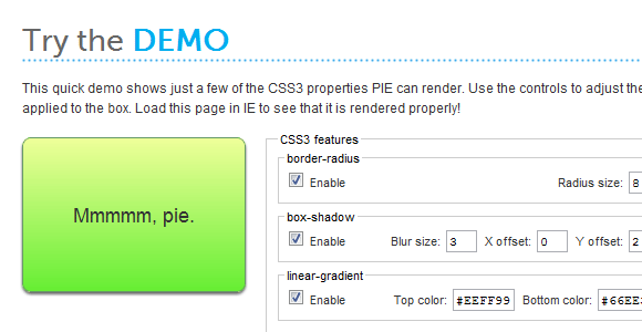
51.CSS3 PIE
PIE stands for Progressive Internet Explorer. It is an IE attached behavior which, when applied to an element, allows IE to recognize and display a number of CSS3 properties.
52.Gridulator
Makes creating pixel grids for CSS very easy.
Adjust the settings on the right to create the button that is right for you website.
54.Primary CSS
Primary is a simple CSS Framework, designed for Developers and Designers in order to make using CSS as easy as possible.
Generate and previe several different CSS3 elements such as CSS text shadawo, border radius, and more.
56.ColorBlendy
Blend colors without having to launch Photoshop. Great for blending different modes like dodge, multiply, and overlay.
57.Minify
Minify is a PHP5 app that helps you follow several of Yahoo!’s Rules for High Performance Web Sites. It combines multiple CSS or Javascript files, removes unnecessary whitespace and comments, and serves them with gzip encoding and optimal client-side cache headers.
58.CSS 2.1 and CSS 3 Help Cheat Sheets (PDF)
Two useful cheat sheets that will help you quickly look up the right CSS 2.1-property or an obscure CSS 3 property. The style sheets contain most important properties, explanations and keywords for each property.
Click the heading to view the details of that property. Information includes browser support and example syntax.
60.The Automatic CSS Inliner Tool
If you’ve ever sent an email campaign, you know that if your CSS is not coded inline, it is likely to get stripped out by email clients, which can make your email design pretty funky looking. Writing CSS inline can be time consuming, and repetitive. MailChimp has a CSS inline conversion tool built right in that will automatically transform all of your local styles into inline styles. Designers have found it so useful, we thought we’d share it with everyone else – even if you don’t have a MailChimp account.
I hope that you had as much fun reading this post as I did creating it. Please feel free to share your CSS related stuff in the comments.

