10 Web Design Mistakes to Avoid

Regardless if you are just starting out as a web designer or you have more than a few hundred designs under your belt, you could easily make mistakes that can affect yours or your client’s web site usability. Listed below are the biggest mistakes in web design:
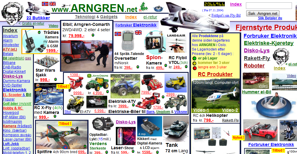
Using Busy or Overloaded Designs
This is a mistake that most novices make as they can easily get carried away by adding dozens of whistles and bells to their designs, which would inevitably make the web site far more difficult to navigate and less user-friendly.

Incorrect Image Usage
Using very large images or scaling down images with the use of the width and height HTML image attributes. Despite the fact that the majority of the surfers might have fast Internet connections, if your website takes longer than average to load, the user could easily click away. A picture is worth a thousand words, but using too many or very large images could hurt your on-site SEO and increase the site loading time.
Poor Navigation
You need to make a website as user-friendly as possible and letting your users navigate it easily should be one of your top priorities. In most cases, keeping the navigation links on the left hand side and across the top works very well, and these links should be highly visible as well.

Overusing Flash, Shockwave, and Java
Although they have their functionality, Flash, Shockwave, and Java should be used only when and if clearly needed since they could cause slower loading times, they are not good for search engine optimization, and they could not be displayed by many mobile devices. If you have designed a Flash intro, placing a clearly visible link to the HTML version of the site is highly recommended.
Using Background Music
Do not “force” any form of audio on your visitors and when you have to use audio in your web pages, provide the user with options of stopping or muting it.
Splitting Content into Many Pages
This is trend that has existed for quite a few years, and although it seems to be dying down, many designers are still using dozens of splash pages to deliver content that could easily fit on a single page. The advantage of displaying more ads to the viewers is greatly outweighed by the chance of chasing them away for good!
Failure to Account for Multiple Screen Resolutions
While most experienced designer use using responsive web design, others ignore lower display resolutions completely. If users have to scroll a web site horizontally, they are likely to click the back button on their browser, and move on to another web site.
Font Selection
As a designer, you are likely to have hundreds of fonts installed on your computer, but most users will have only the ones that came by default with their operating systems. Stick to using the default fonts and use small sizes only on short snippets of text.
Pop-up Windows
The pop-up windows, along with the background music are the two main reasons for users to leave your site and never come back.

Failure to Provide a Search Option
This might be perfectly acceptable for a single page web site, but for large sites with plenty of content and dozens or hundreds of web pages, a search option is a must-have.
This is just a small list of the biggest mistakes in web design, but even before getting to the drawing board, you need to put yourself in the shoes of the site’s visitors. A web surfer, who has stumbled upon your web site, should be able to load it in less than four seconds, figure out its purpose in less than four seconds, and easily find their way around!
