5 Typography Tips for Web Designers

With the increasing importance of relevant and content-rich websites, many web designers are starting to pay special attention to typography, a crucial element, often ignored in the past. There is no use having excellent content if that content is not presented well to the visitors, and most of them would quickly hit the “back” button on their browsers if they see illegible text, conflicting colors, or mixture of different font types and sizes, crowded on the same web page.
What are the most important typography elements, which web designers should pay attention to?
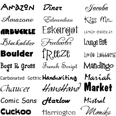
Fonts
 For starters, the font should match the site’s theme and niche. Using CSS allows for more than one font to be selected and adding list of fonts (also known as stacks) rather than a single one is always a wise choice. Most Windows machines come with the same popular fonts installed by default, but Mac users might have different default fonts and their browser will simply choose the first available font from the list. Selecting the font size also requires careful consideration since smaller letters are difficult to read, while using bigger size might force the users to scroll up and down in order to see the content of the web page. The color is also important and while black on white is always a good choice as it gives decent contrast and ensures readability, white or gray font colors could work well in some case too.
Other Font Elements
Ascender is the upward portion of lowercase letters such as l, t, h, b, d, and descender is the downward portion of letters such as q, g, and p. The x-height is defined as the distance between the mean line and the baseline in a typeface and this is typically the height of the letter x in the font, hence the name. Kerning and leading refer to the space between letters in a word and the space between lines respectively and can be used to make sure that the letters do not appear scrunched up or spaced out.
Styling the Web Page
 When styling the page, attention needs to be paid not only to the font’s properties, but to white space and alignment as well. The proper use of headings, paragraphs, and hyperlinks would make the content easy to read and draw attention to the important elements. Left alignment is used to present easy to read text, center alignment is appropriate for titles and headlines, and right alignment is commonly used in business correspondence.
Compatibility
As a rule, the web sites should be designed for “basic” machines, where only the default fonts are installed, and these designs should be loaded in the top browsers in order to ensure that they are displayed properly. In addition, choosing typography, which will make the website easy to surf on mobile devices, is something worth considering. With the increasing popularity of mobile surfing and the number of Smartphone and tablet users growing at an exponential rate, using fluid and responsive design is quickly becoming essential.
Mixing fonts
Mixing fonts should be done with caution and the rule of thumb is to be rather conservative than over-creative. Most designers are tempted to build pages that stand out and are different and although this could work well in many cases, when it comes to presenting content, legibility is the most important factor. Typefaces with similar line quality or proportions might work well and establish visual hierarchy throughout the site, while contrasting fonts could be used to draw attention to areas of interest.
